![Text logo reads Simpli [house emoji][heart emoji] Painted. Preferred for a reason. The house and heart emojis replace the word love. Black text on a white background.](https://simplipainted.com/wp-content/uploads/2026/08/cropped-IMG_3593.jpg.webp)
What Color Should I Paint My Kitchen Cabinets? How to Choose (and Not Regret It)
A cabinet color consultation is where a successful kitchen or bath transformation begins. The right paint color can make well-built cabinets feel current, brighten a room, and create the polished look of a larger renovation. The wrong choice can pull against the countertops, flooring, and lighting you already own, leaving the room feeling less intentional than it did before.

For Charlotte-area homeowners who want to update structurally sound cabinetry without the cost and disruption of replacement, color selection deserves more than a quick look at a fan deck. A professional consultation considers how a color will live in your home, not just how it looks on a small paper chip.
Why Cabinet Color Requires a Different Approach
Cabinets occupy a large visual area and sit beside many fixed finishes. Countertops, backsplash tile, hardwood floors, wall color, appliances, and hardware all influence the final result. Because cabinet doors have sheen and dimension, their color can also read differently than the same paint applied to a flat wall.
Natural light is another major variable in homes throughout Lake Norman, South Charlotte, Waxhaw, Matthews, and Cornelius. A warm white that feels clean and inviting in a sun-filled kitchen may look noticeably creamier under low evening light. A cool gray or blue-gray can appear sophisticated in one room and flat or cold in another. The goal is not to select the trendiest color in isolation. It is to choose a finish that feels right across the conditions your kitchen or bathroom experiences every day.
This is especially important when homeowners are preserving existing countertops or flooring. Cabinet refinishing is a smart investment because it keeps quality cabinet boxes in place, but it also means the new color must work with materials that are staying. A thoughtful consultation turns those fixed elements into design anchors rather than obstacles.
What Happens During a Cabinet Color Consultation
A quality cabinet color consultation starts with the room itself. Rather than beginning with a favorite color from social media, the conversation should focus on what is staying, what may change, and how the space is used. A busy family kitchen, a formal entertaining space, and a compact bathroom vanity can call for very different color directions.
The existing cabinet style matters as well. Raised-panel maple doors, simple Shaker fronts, and traditional cherry cabinetry each respond differently to a color transformation. Paint can modernize many door styles, but the best color choice should complement the scale and character of the cabinetry rather than fight it.
Your consultant should also evaluate the countertop’s undertones. White quartz with subtle gray veining, warm granite, creamy marble-look surfaces, and darker speckled stone can all influence whether a cabinet white needs to lean warm, neutral, or crisp. Flooring presents the same challenge. Honey oak, espresso-toned hardwood, gray luxury vinyl, and patterned tile each bring a different temperature into the room.
At Simpli Painted, this design conversation is connected to the refinishing process from the start. Color is not treated as a separate decorative decision. It is part of a complete plan for achieving a smooth, durable, factory-finish appearance on doors, drawer fronts, and cabinet frames.
Looking Beyond a Tiny Paint Sample
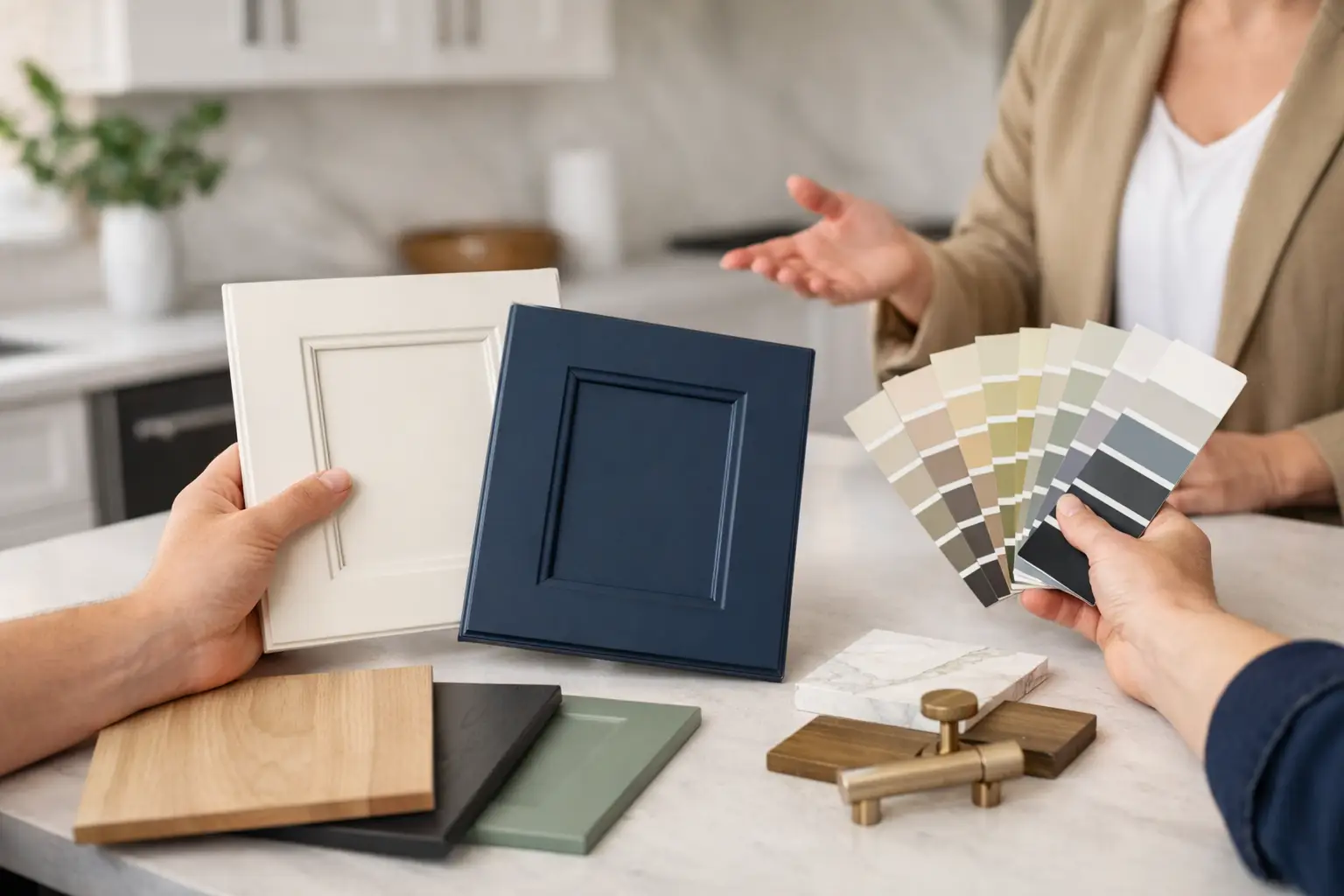
Small samples are useful starting points, but they cannot show the full effect of a cabinet finish. Color changes depending on the surrounding materials, the angle of light, and the amount of surface area painted. A white that appears neutral on a sample card may reveal yellow, gray, green, or pink undertones once it covers an entire bank of upper cabinets.
Larger color samples are more revealing, particularly when viewed at different times of day. Morning sun, indirect afternoon light, and evening overhead lighting can all shift the way a finish reads. Homeowners should also consider the view into adjoining spaces. Open-concept Charlotte homes often require cabinet colors that connect naturally with nearby living areas rather than creating an abrupt visual break.
Best Cabinet Paint Colors: What Homeowners Ask For Most
When homeowners ask “what color should I paint my kitchen cabinets,” the answer almost always lands in one of five families. What decides it is the light in the room, the countertop that is staying, and the floor.
- Whites and off-whites. The most common choice by a wide margin. The trap is undertone: a white that reads clean on a chip can go yellow next to a cool quartz or blue next to a warm floor. This is why a large sample viewed in your kitchen at different times of day beats a card. See white vs cream cabinets.
- Greige and warm gray. The safe middle ground when white feels stark and the room has warm wood floors or brass hardware.
- Navy and deep blue. Usually on the island or the lower cabinets with white uppers. Two-tone kitchens are where most deep blues end up.
- Green, from sage to deep forest. Increasingly popular, and the color most likely to date a kitchen if the shade is wrong. Sage reads neutral in a bright room; deep greens need good light or they go black.
- Charcoal and black. Dramatic and durable, but they show every fingerprint on a matte sheen. Satin is the usual compromise.
Choosing Between White, Neutral, and Darker Cabinets
White remains a popular cabinet color because it can make a kitchen feel brighter and more open. Yet there is no single “best white.” Soft warm whites often suit homes with beige, cream, or warm wood finishes. Cleaner neutral whites can work beautifully with marble-look counters and contemporary tile. Stark whites may be effective in the right setting, but can look harsh beside warmer fixed materials.
Greige, taupe, mushroom, and muted putty tones offer a softer alternative for homeowners who want light cabinetry without an all-white kitchen. These colors can add depth while remaining versatile, especially when the room has warm stone countertops or natural wood flooring. Their trade-off is subtlety: undertones matter greatly, and a neutral that seems balanced in one kitchen can look too gray or too beige in another.
Darker cabinet colors, including deep navy, charcoal, forest green, and black, can create a striking focal point on an island, lower cabinets, or a bathroom vanity. They bring contrast and can give traditional cabinetry a more tailored appearance. However, dark finishes show dust, fingerprints, and everyday wear more readily than mid-tone or light colors. In a smaller kitchen with limited natural light, using a dark color on every cabinet may also make the room feel more enclosed.
Two-tone cabinetry can be an excellent middle ground. Light upper cabinets help preserve brightness, while a deeper island or base color adds visual weight. This approach works best when the colors have a clear relationship to the countertop, backsplash, and hardware. It should feel deliberate, not like two unrelated paint choices placed in the same room.
Finish Sheen and Hardware Complete the Color Story
Color is only one part of the finished appearance. Sheen affects how cabinetry reflects light and how the surface feels visually. A carefully selected cabinet coating provides a refined, furniture-like look while offering the cleanability needed in a hardworking kitchen or bathroom. The finish should look smooth and consistent, not overly shiny or brush-marked.
Hardware is equally influential. Brushed nickel, polished chrome, warm brass, matte black, and bronze each change the personality of a cabinet color. A neutral painted cabinet can feel classic with nickel pulls, more contemporary with black hardware, or warmer and more decorative with brass. If existing hardware will remain, it should be part of the consultation. If it will be replaced, choosing color and hardware together prevents costly second-guessing later.
Color Selection Must Support a Durable Refinish
Even the most beautiful color cannot compensate for poor preparation. Cabinetry collects cooking oils, hand residue, cleaning-product buildup, and years of everyday wear. For a lasting finish, surfaces need meticulous cleaning and degreasing, proper sanding, high-quality priming, and controlled spraying of doors and drawer fronts.
This specialist process is why cabinet painting differs from standard wall painting. A durable cabinet finish needs adhesion, even coverage, and a smooth texture that holds up to regular cleaning and use. The consultation establishes the visual direction, while disciplined preparation and spray application make that direction look finished rather than merely painted.
If you are considering a cabinet update, bring your questions, finish samples, and future plans to the conversation. The best color is the one that respects the materials you love, improves the parts of the room that feel dated, and still feels like home when the light changes at the end of the day.
What Color Should I Paint My Kitchen Cabinets? Quick Answers
What is the most popular cabinet paint color?
White and off-white, followed by greige. Two-tone kitchens (white uppers with a navy, green, or charcoal island or lowers) are the most common way homeowners add color without committing the whole room.
Should cabinets be lighter or darker than the walls?
Either works; contrast is what matters. Cabinets and walls in nearly the same color with different sheens tends to look unfinished. Pick one to be clearly lighter.
Can I see the color before you paint everything?
Yes. Ask for a large sample and look at it in your kitchen in morning, afternoon, and evening light before the project starts. A small chip from the store does not show how a finish will read across an entire bank of cabinets.
Thinking about your own cabinets?
Simpli Painted refinishes existing cabinets in the Carolinas and coastal Georgia. Doors and drawer fronts are sprayed in our shop, the boxes are finished in place, and every job carries a 2-year warranty against peeling, blistering and yellowing. 4,000+ kitchens, backed by five-star Google reviews.
Send 3–4 photos of your kitchen and we’ll quote it.